4 Steps to a Smarter Risk Heat Map
How to base those colors on a solid foundation of cyber risk quantification.
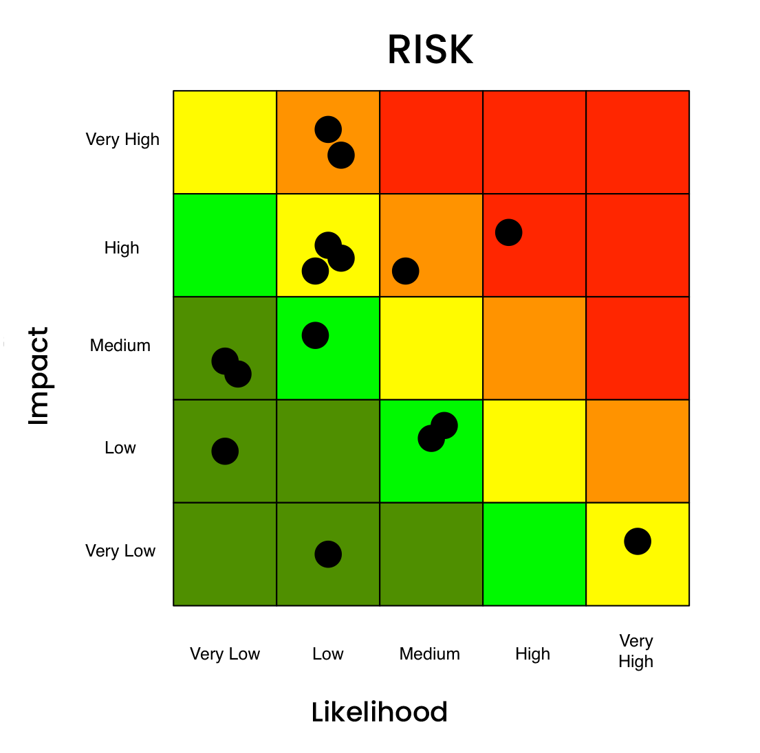
The cybersecurity risk heat map. An industry staple for many years. The standard 3×3, or 5×5 risk chart heat map that plots likelihood (or frequency) on one axis, impact (or magnitude) on the other, with colors ranging from green to yellow to red. Heat maps can be an effective visual aid to reporting on cyber risk – or an easy button that substitutes for rigorous risk analysis and misinforms decision-makers.

In this blog post, we will walk through:
- The problems of cyber risk heat maps as they are typically used in risk analysis for cybersecurity
- How to apply cyber risk quantification to make heat maps based on solid risk analysis that support business decision-making
What’s Wrong with the Typical Cybersecurity Heat Map
Risk Analyst #1: “I’m feeling like this next “risk” is a “red.”
Risk Analyst #2: “I don’t know about that; I’m thinking it’s more of a “yellow.”
Risk Analyst #1: “Whatever. Let’s call it a day and place it as a “burnt orange.”
The heat map comes under suspicion due to its frequent association with poor “qualitative” risk assessment processes that rely more on subjectivity, feeling and a lack of critical thinking. As a result, the heat map is often a leading indicator of a more systemic concern about an organization’s risk management program. Examples:
1. Decreased consistency with increased subjectivity
How do you know that your yellow equals another person’s yellow? Or that your medium-low equals another medium-low? By using qualitative terms to express the level of risk, you inherently make the assessment more subjective and decrease consistency between analysts. How can a team of analysts break down, understand and come to a consensus around a risk if they’re not all working from the same definitions and mental model? The short answer is, they can’t. At least not reliably or consistently.
2. Can’t prioritize risks
During the analysis process, you’re inevitably bound to end up with a series of findings in the same quadrant or color spectrum of the heat map. With these overlapping findings, how do you prioritize which risk to tackle first? How do you know which red is more red than the other reds? Absent a means of quantifying the risks, the short answer again is, you can’t.
3. Defending your findings or conclusions
When operating on little more than gut feeling and shooting from the hip, it is exceptionally difficult to stand behind your findings or conclusions in any meaningful manner. This means that you are just one question away from an executive asking, “How did you come up with that risk rating”, to lose all credibility in your company.
A Better Way: Heat Maps Based on Quantifying Cyber Risk
Let’s give heat maps their due: As a means of communication, the heat chart does a pretty effective job of relaying which risks are of most concern to your audience. In a simplistic fashion, using stoplight colors that we all learned back in preschool (green, yellow, red), a risk analyst can quickly, and rather effectively communicate which risks are of most and least concern.
You can build a heat map on a solid foundation of objective, quantitative analysis. Here’s how:
Step 1: Standard Risk Analysis Model
The first step is to get the organization to understand that the way they’ve been conducting risk assessments is at the root of the problem. The lack of a well thought-out, structured, and consistent approach leads them to a set of results that are often inaccurate and indefensible.Key Distinction: The heat map is a means of communicating analysis results not a means to do the analysis.To turn this around, we need to put in place its complete opposite, cyber risk analysis that uses an industry vetted model that breaks down risk into its core components, increases consistency among analyses, fosters critical thinking and communication, as well as defensibility of results.Factor Analysis of Information Risk (FAIR™) is the standard for quantification of cyber and technology risk. The SAFE platform enables and automates FAIR quantitative risk analysis.
Step 2: Translation to Risk Scenario
The next step in the process would be to translate those “risks” identified in the heat map into risks–or loss events—with a clearly defined threat actor, asset at risk, and method of attack. The items that typically show up in a heat map, or a risk register are often not loss events, but other components of the risk landscape (i.e., “Insider Threat” is better understood as a “Threat Community”; “Cloud” as an “Asset”; “Application Vulnerabilities” as a “Control Deficiency”).The approach here is to tease out and translate the organization’s concern, “Cloud”, into a loss event or risk scenario: a threat actor causing a breach of sensitive customer information stored in the cloud. The translated statement is something we can perform a quantitative analysis on, based on likelihood and probable financial impact.
Step 3: Quantitative Cyber Risk Analysis Process
Following translation, we would then move into the phases of the risk analysis process:
- Scoping:
Take the translated statement and make sure we have a good understanding of the scenarios: asset(s), threat(s), impact(s), and, most importantly, how the loss event would play out.
Scoping:Take the translated statement and make sure we have a good understanding of the scenarios: asset(s), threat(s), impact(s), and, most importantly, how the loss event would play out. - Data Gathering:
Collect and enter data drawing on the latest signals from across the organization’s attack surface and controls environment, its internal loss data, as well as industry-standard data on cyber incidents. - Run/Refine:
Hit the run button, then review the results with a critical eye, ensuring they accurately reflect the problem being analyzed, along with all the information received along the way. Note: In FAIR practice, results are achieved via Monte Carlo simulations as a range of probable outcomes for event frequency and impact. - Identify, Rank Top Risks:
Repeat the quantitative analyses to develop a list of top risk scenarios based on probable loss and likelihood.
Step 4: Quantitative Risk Reporting with a Heat Map
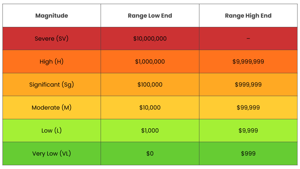
Although reporting is a key phase of the risk analysis process, it is broken out here to highlight the extra step of mapping quantitative ranges (based on the organization’s loss experience) to the colors that make up the heat map to infuse this communication tool with more objectivity (as in this example from the Open FAIR Standard documentation):

It’s a simple next step to assign a color to a risk based on ranges of probable loss exposure, and plot risks on the heat map or other risk chart.
Where previously we were not sure if one person’s red is the same as another’s, by mapping the colors to quantitative ranges, we increase the chances that all parties involved are on the same page when discussing the risk. Additionally, you provide your stakeholders with a set of results in a format they are familiar with, but this time around, they are backed by a sound, repeatable process.
The Heat Map – Automated and Re-imagined by SAFE

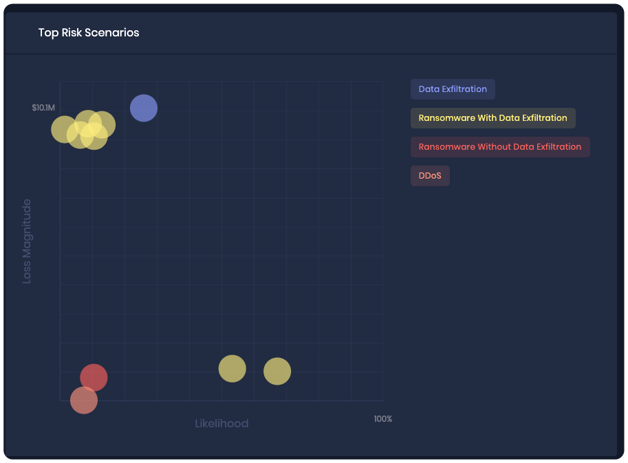
Heat Map from the SAFE Platform
The SAFE platform generates an automated heat-map view of top risk scenarios plotted by magnitude of dollar impact and probability of occurrence in percentage terms, as estimated by FAIR analysis. The platform generates a heat map instantly, showing an up-to-the-minute view of risk based on real-time data collection from the attack surface, in an interface ready for presentation to stakeholders.
Quantitative Risk Assessments – More Accurate than Ever with FAIR
Two new extensions of the FAIR standard bring an unprecedented level of confidence to the FAIR risk analysis process:
- FAIR Controls Analytics Model (FAIR-CAM™)
FAIR-CAM enables quantification of the value of any cybersecurity control for risk reduction. Now we can understand where controls fit into the loss event chain and take into account their effectiveness. - FAIR Materiality Assessment Model (FAIR-MAM™)
FAIR-MAM tracks an organization’s loss data in 10 categories down through three to five (or more) layers of subcategories so the loss can be modeled with customization to any organization’s business structure, assets, risk scenarios, or other requirements.


